StreamRaiders
RESPONSIVE GAME FEATURE
Client: Stream Captain
Role: UX/UI Designer
Team: Myself & Mike Mariano (Lead UX Designer)
Tools: Figma, Zoom, Adobe Photoshop
The Problem.
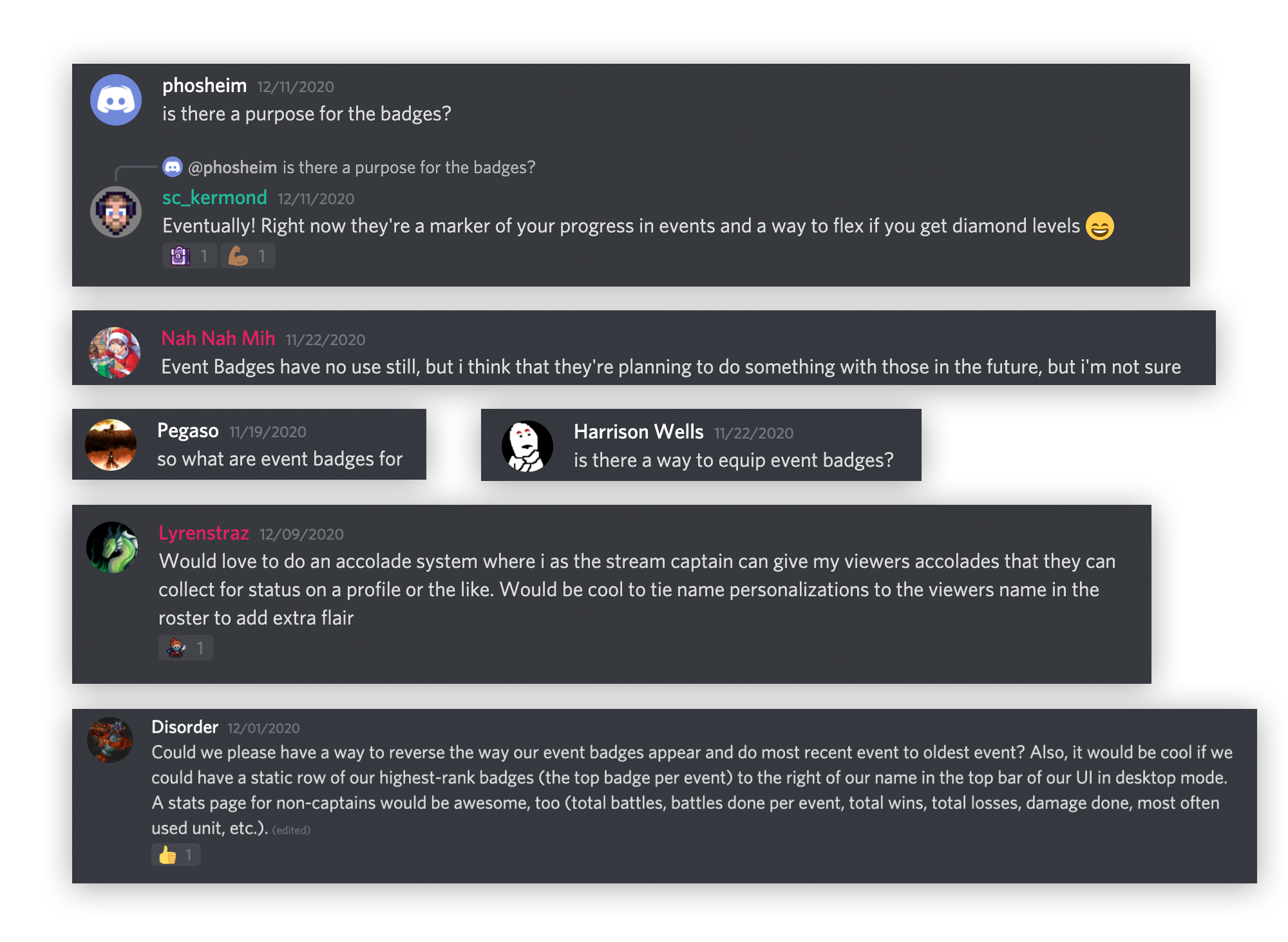
Deducting from Discord
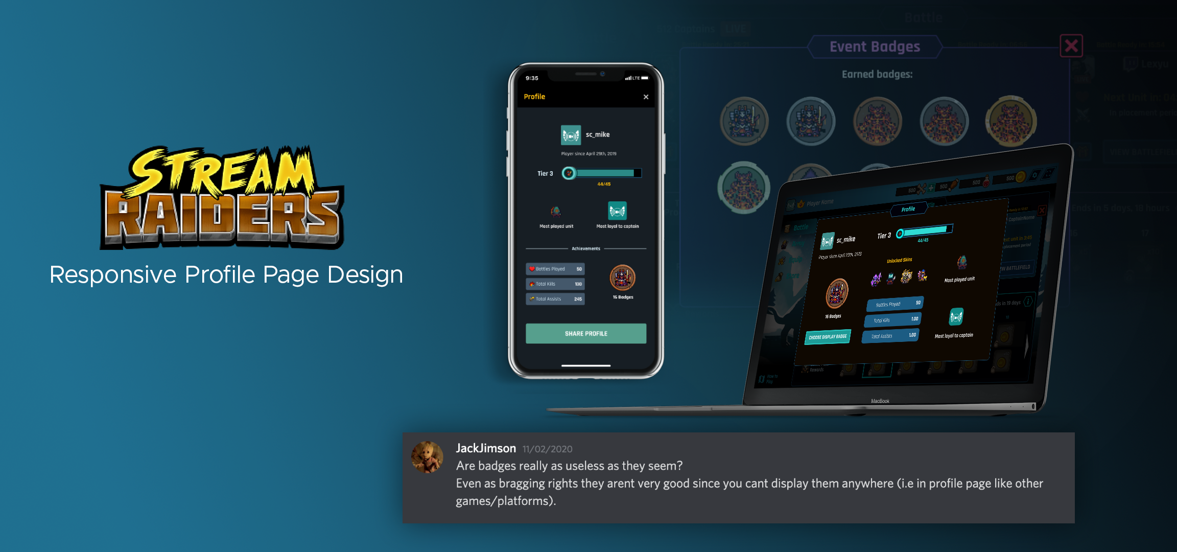
Stream Raiders is a game created for Twitch streamers to play with their viewers. Through a #feedback channel on Discord, it became apparent that badges were an underutilized feature in the game. Mike, (UX lead designer) tasked me with exploring how we could display badges throughout the game in a more impactful way.
At the time, I worked as a visual designer for Stream Captain and helped mainly on social media posts. With the game going through multiple updates at once, the developers never prioritized designing a profile screen for their users. Mike felt it was a feature that I could get started on and present to developers.
How might we create more value around
badges and in-game achievements?
The Soultion.
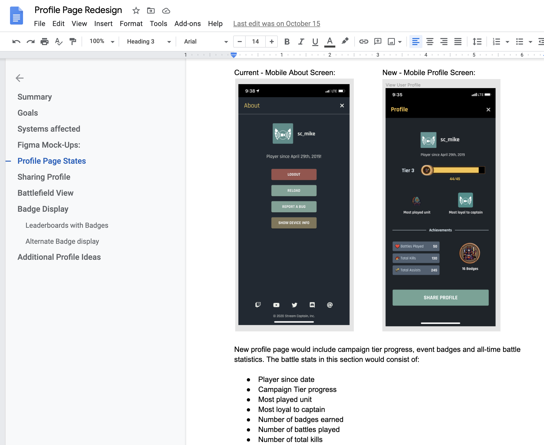
Before and After of Profile Page for the desktop version of Stream Raiders
Emphasizing Player Achievements
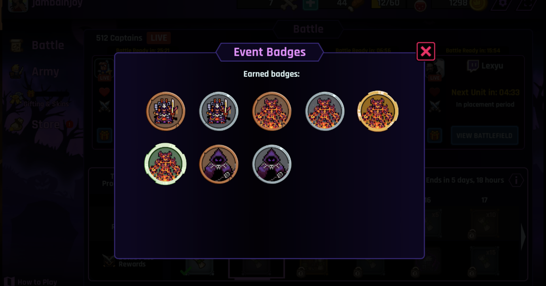
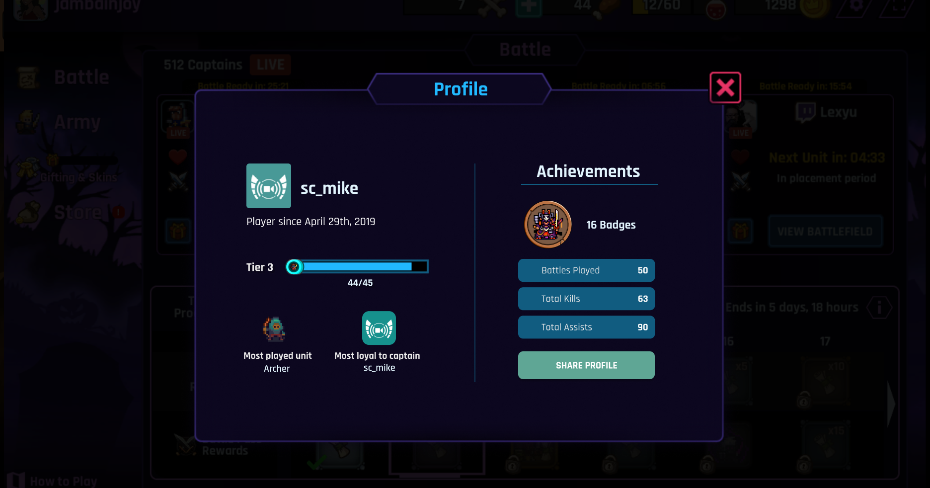
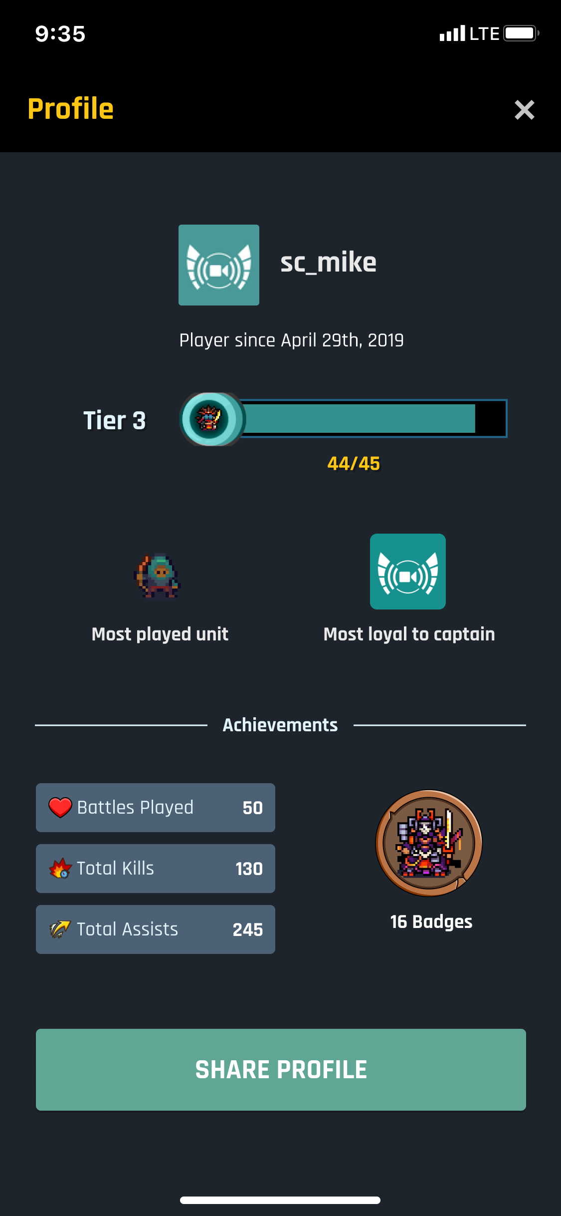
Without a full-profile created, there currently isn't a way to showcase long-term achievements within the game. Player scoreboards are shown per battle, but otherwise, there is no way to show-off your long-term progress. The current player "profile" only shows a user their earned badges. These badges are not visible to anyone but the user themself. I decided to design a profile page that highlighted player achievements and statistics. I created a user flow that would link units in the game to players' profiles.
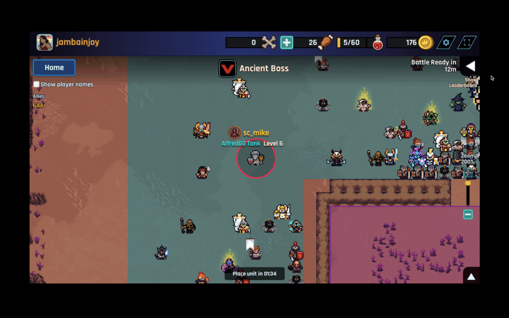
Prototype of the user flow for viewing player's profile screen on desktop
GOALS:
- Design a profile page that showcases user achievements
- Create more cohesion between the UI of Mobile Lite and desktop
- Create an option for users to share their profile on social
- Lower priority - Create an Event Badges screen with sorting capability
CHALLENGES
Working towards Responsive UI Design
One of the challenges in designing for Stream Raiders is how the user interfaces are different for desktop and mobile. Their mobile was developed using React while the desktop version was created in Unity. Buttons and other UI elements were not consistent and I had to try to create cohesion between the two. I was advised to use mobile elements on the desktop screens since they would ideally be switching the desktop version to React in the future. Color styles for the screens were not important in my mockups since the color scheme of the UI changes with each new event. I utilized the system font and typography treatment in my designs.
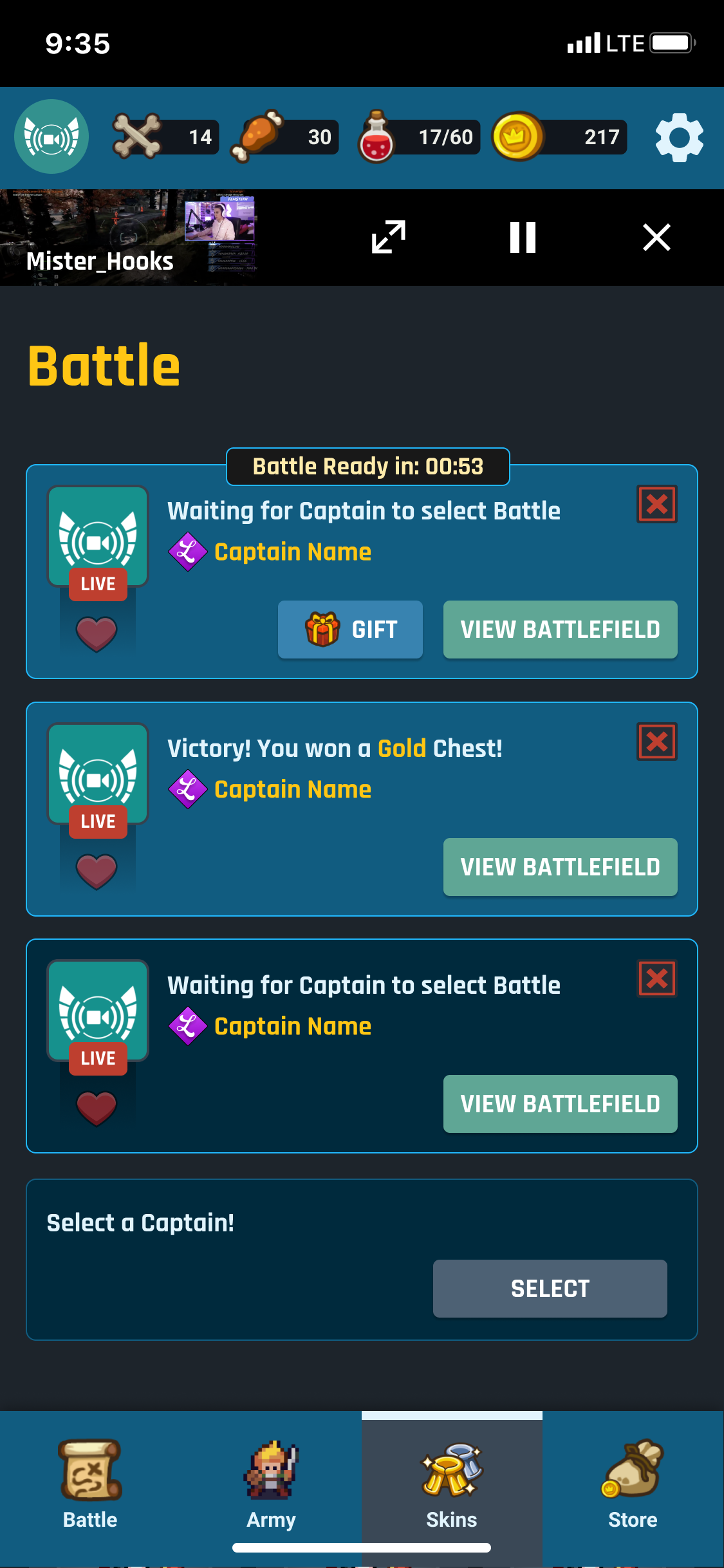
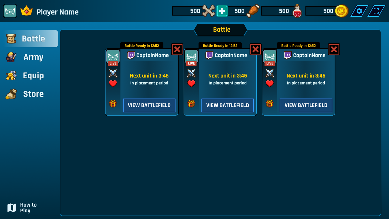
Screenshots of Mobile vs. Desktop version of the Stream Raiders Battle Screen
PROJECT SCOPE
Presenting the Profile Screen
To share this idea with the rest of the team, I prepared a scope sheet with my mockups on Google Docs. Link to scope sheet here.
This file was shared with developers, the general manager and the CEO. Over Zoom, I presented the mockups and described the thought process behind each idea. Afterward, we discussed the feasibility of incorporating each into the game.
The team was overall impressed with the designs and positive about our ideas. However I found out that there are new features about to be added to the game such as "quests" that would change how achievements would be counted.
MARKETING INTEGRATION
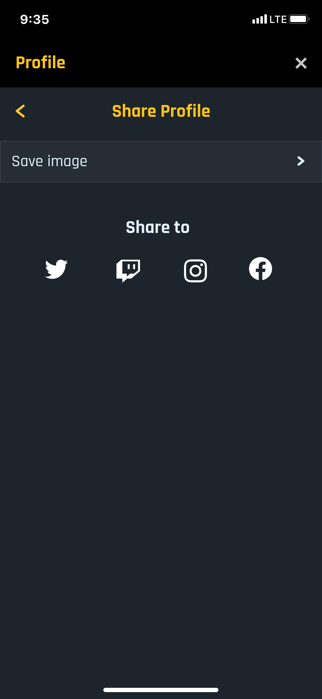
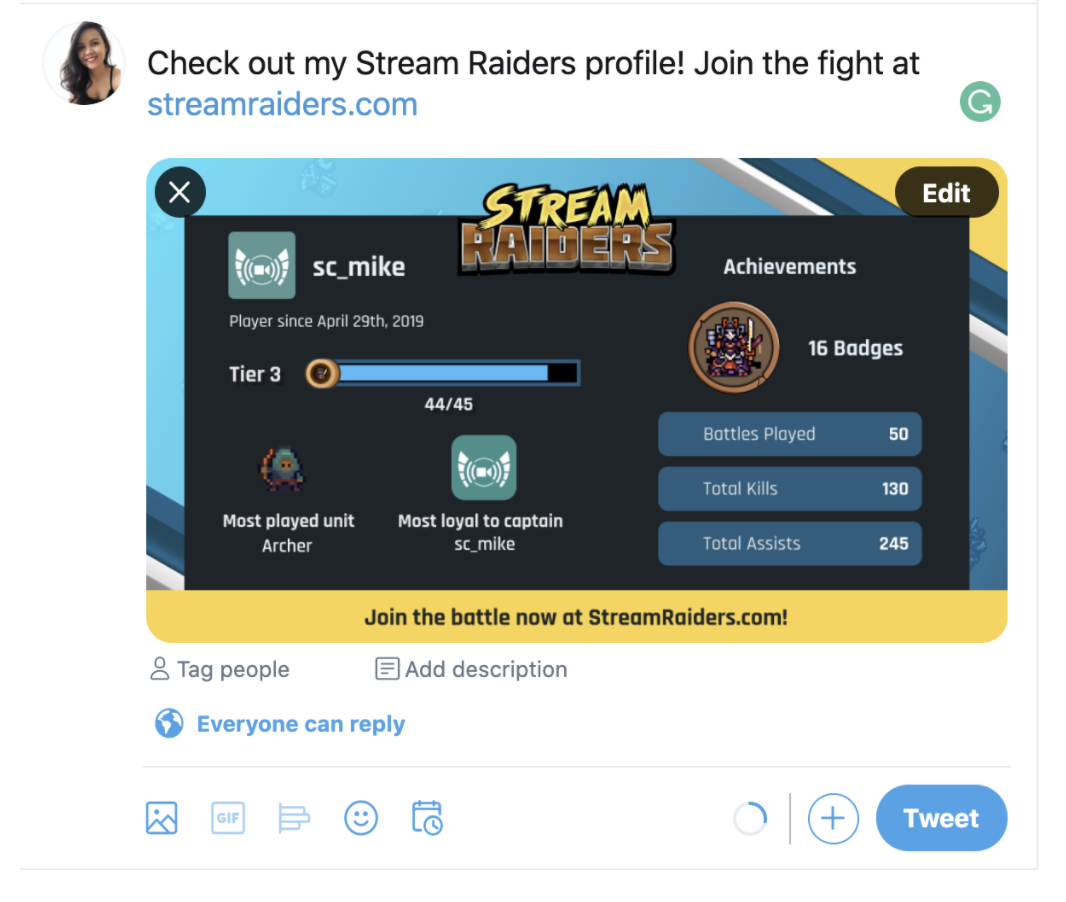
Social Sharing for Profiles
After designing how a profile page could look, Mike and I discussed how it could help increase player engagement and growth if these achievements could be shared on social platforms. I designed how the share profile screen would look. Then, I used a background design (that I made for other marketing posts) to create a template that could generate a Twitter post graphic with user stats.
IMPROVING A FEATURE
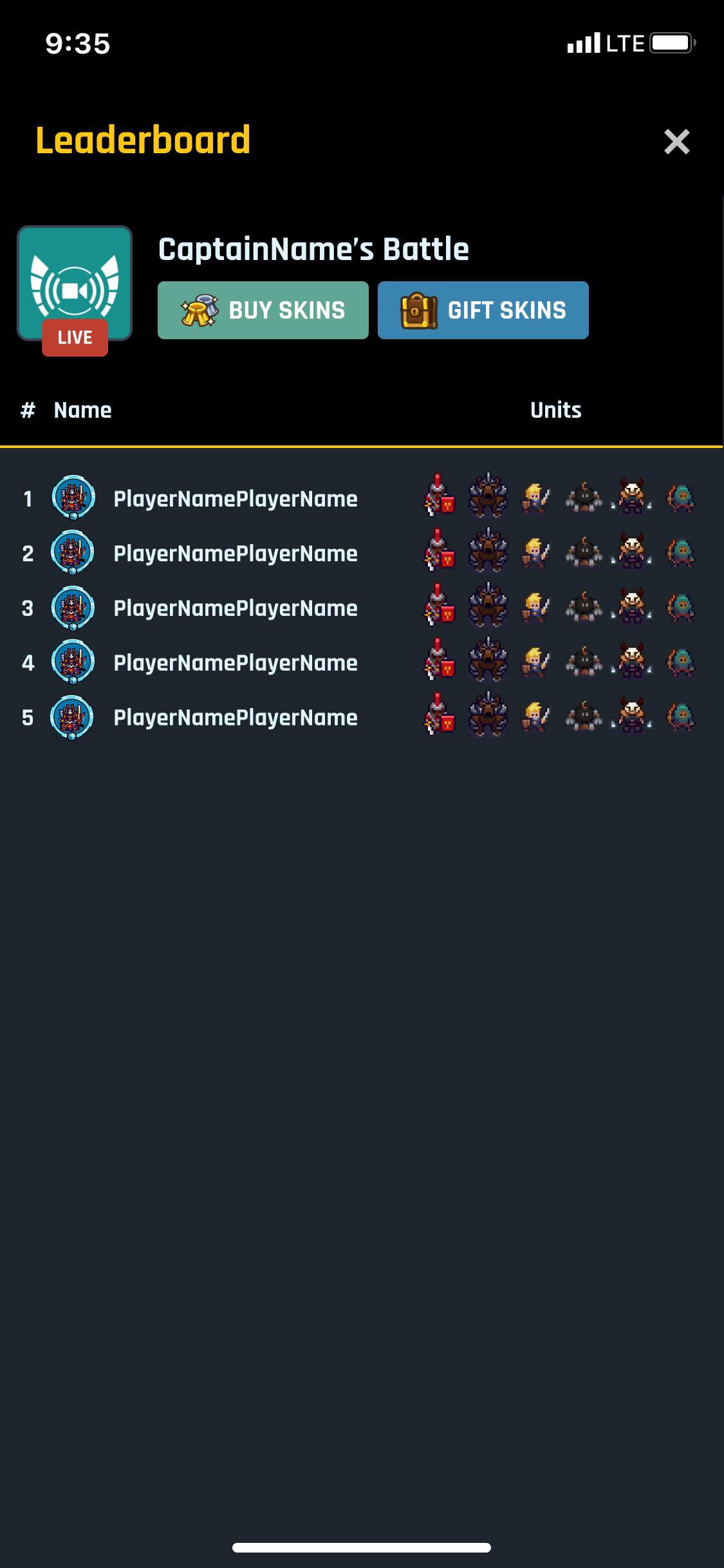
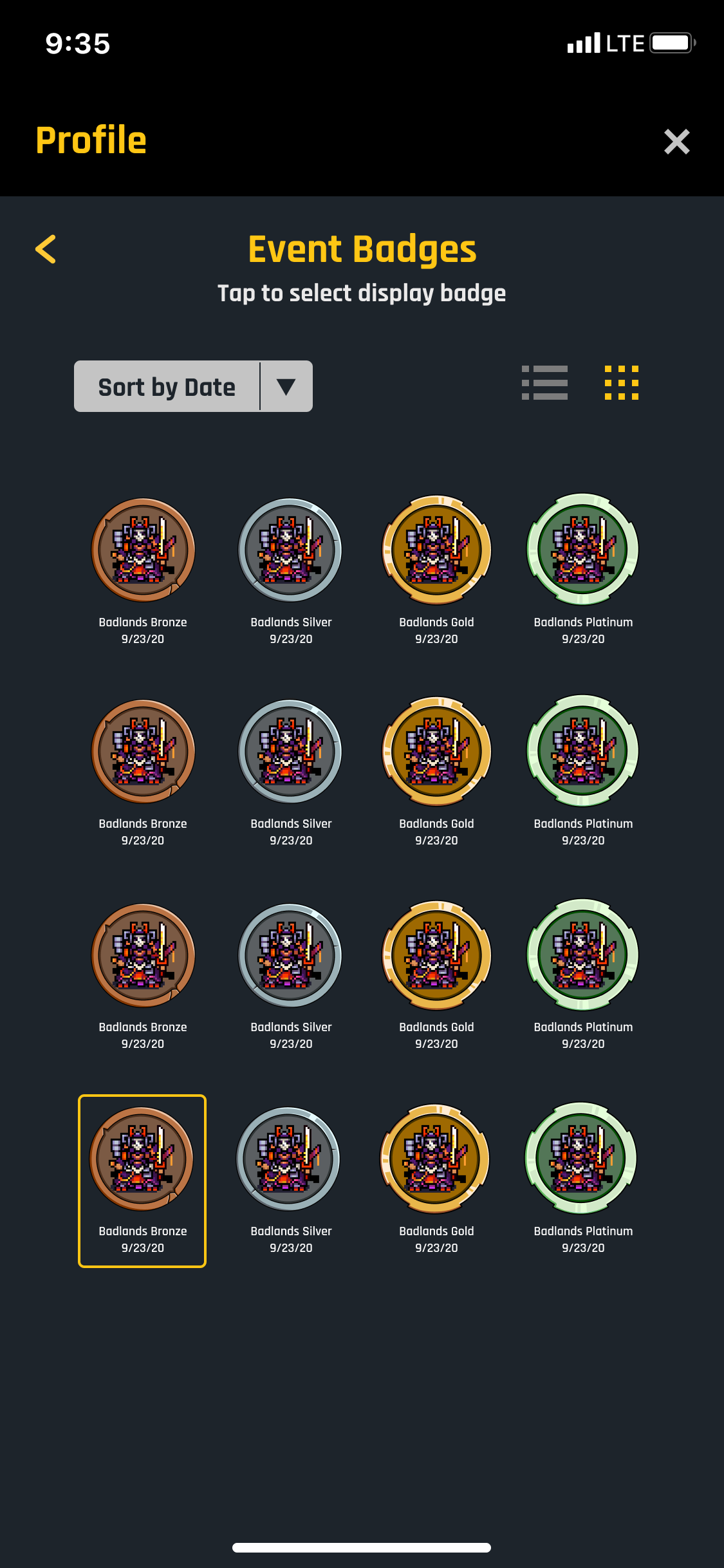
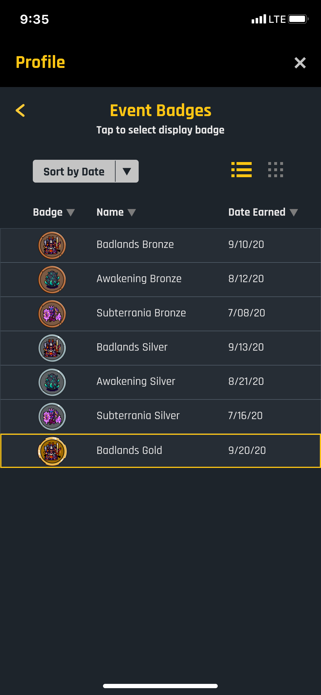
Organizing Badges
Another request for this design scope was to improve the sort ability of earned badges. The drop-down sort menu was already designed for the mobile interface, but I had to design how the badge elements would be arranged. Mike, the UX lead suggested I create a grid and a list version to view the badges. I came up with the idea that the user could pick a badge to be displayed with their username on leaderboards and on their profile.
RETROSPECT
Not a Priority Feature
In the end, the profile screen feature is still considered a low priority compared to other updates that are expected to drive profit. I knew when assigned it, that it wasn't a high-priority project. I wish I was provided information on the release of the "quests" update, so I could factor that into my design.
Although my designs will not be implemented soon, Mike was impressed by my presentation and felt I did well explaining all the ideas thoroughly before letting the team divulge into feedback. Overall, I'm grateful for the opportunity to work on adding a feature to their great game.
If I were to work on this again, I would want to pursue user research to help validate the need. It's clear that it's a feature expected by players, but it is hard to gauge how building it will positively impact the players/company. It could be worth doing user testing with the prototypes to see if players enjoy the changes.
View More Projects

WayfinderProject type
Convenient CheckoutUX Design
GaydarDATING - Mobile App
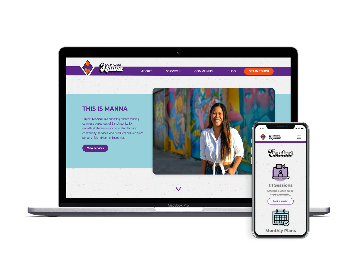
Project MannaBUSINESS - Responsive Website